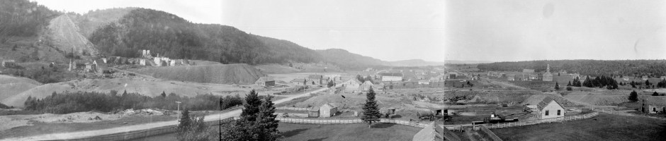
Visualizing the map in progress, 2010-2014
The vast majority of data was collected in 2010 and 2012, as those were years where primary focus was on mapping Cliff and Clifton, respectively. In 2011, 2013, and this year, mapping is secondary, though what has been mapped has filled in the edges somewhat. The 2014 season is not over, and the focus is on more features located at the periphery of the site: cemeteries, roads, the North American mine site (off the map, and to the southwest of this image).

2 responses to “Visualizing the map in progress, 2010-2014”
Trackbacks / Pingbacks
- - June 16, 2014
Leave a comment
Recent Comments
if(typeof(networkedblogs)=="undefined"){networkedblogs = {};networkedblogs.blogId=414196;networkedblogs.shortName="cliff_mine_archaeology_project";}

Awesome Sean, thanks for posting. Love the graphics